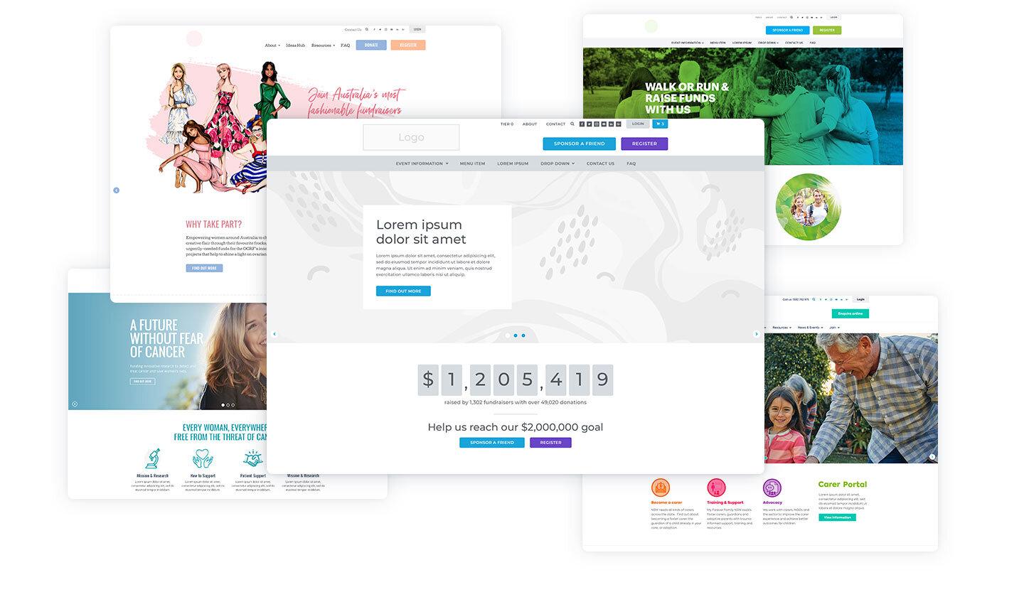
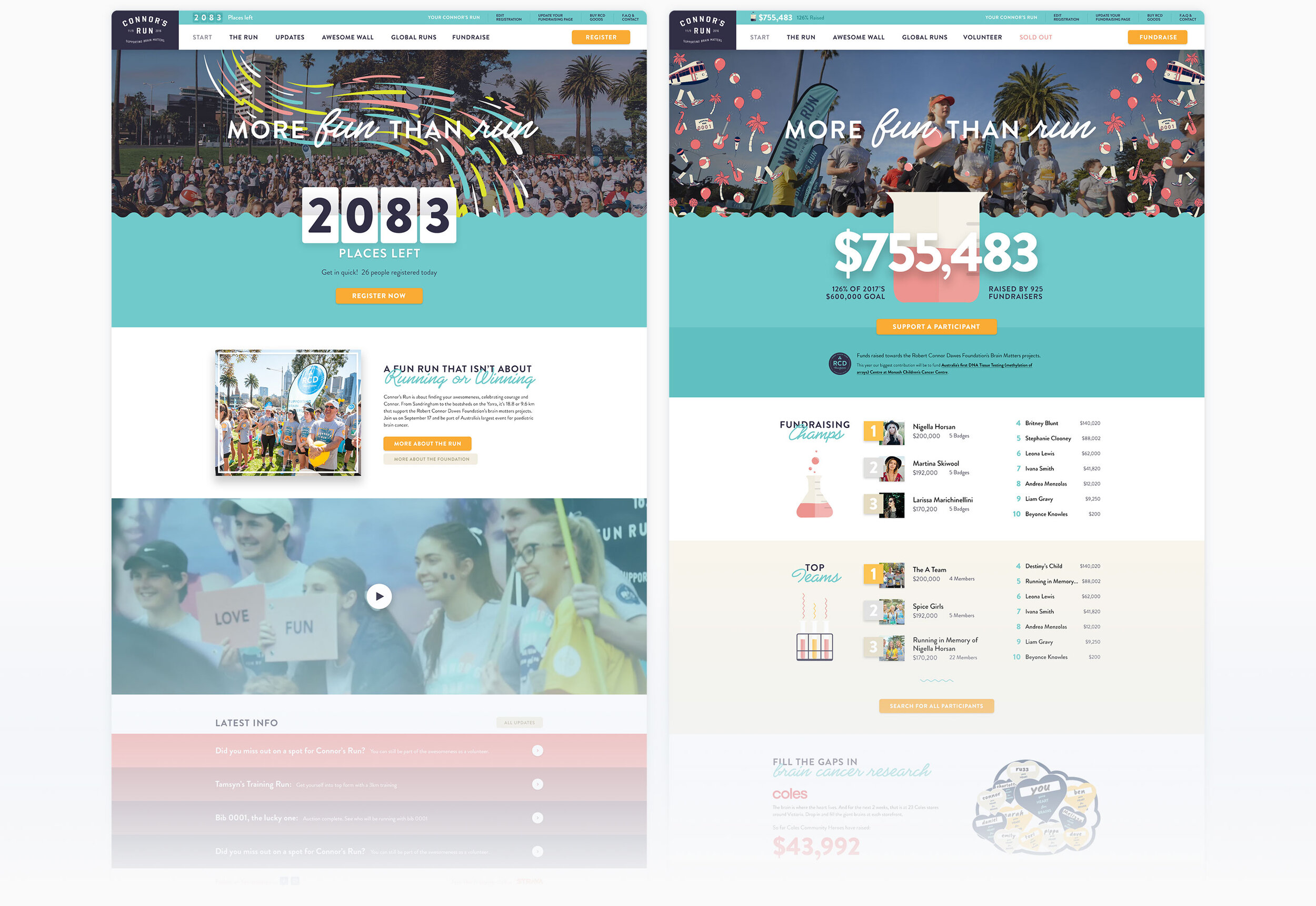
Event website

Connor's Run.

Crafting an enjoyable fundraising experience.


Goal

Despite their motto ‘More fun than run’, the team at Connor’s Run realised their online registration experience was anything but.

Most of their registrants wouldn’t even create a fundraising page. Connor’s Run needed to stop moving their supporters through multiple platforms, and instead create an integrated and enjoyable experience.

Answer

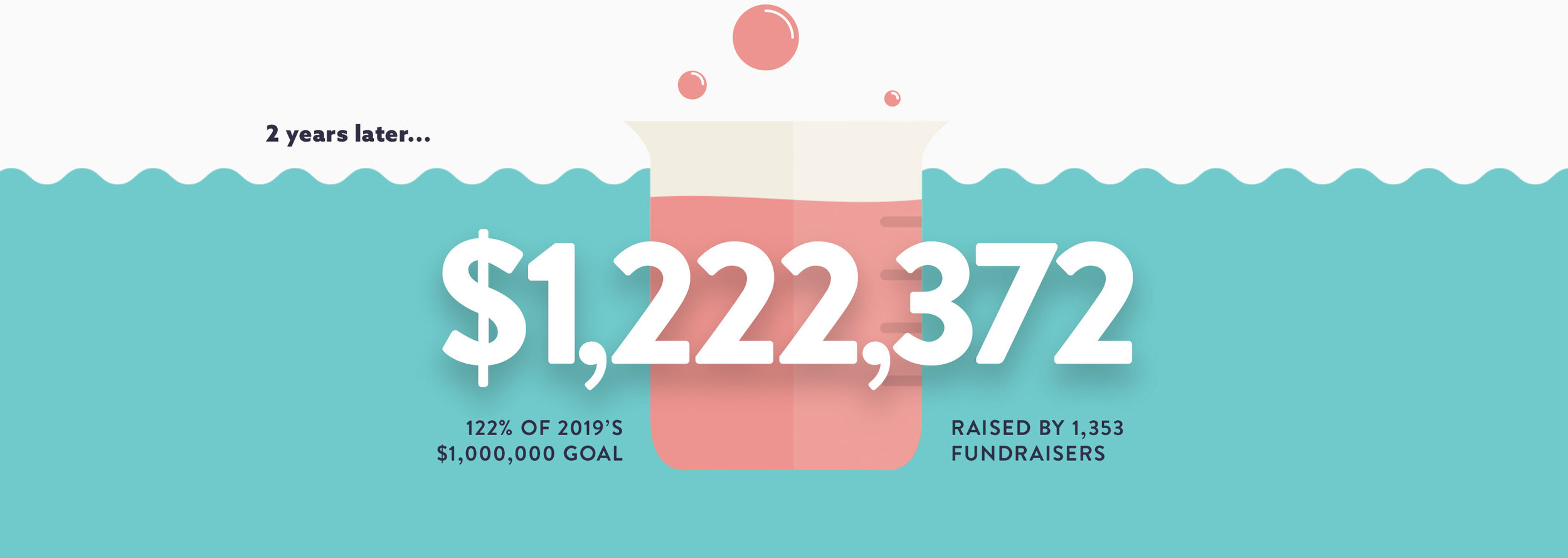
Working with the insights Connor’s Run had gathered from previous years, we helped them create an enjoyable registration process.

Their supporters could now buy tickets, add merchandise, and create their fundraising page, all within one simple flow. And when they raised money, they earned incentives.

What I Did

User experience
Design


connors_hero.jpg


Keeping it fresh.

Content that lives and grows with the event.

The homepage of Connor’s Run wasn’t just a static page that grew old as time went by, it would adapt and change depending on the stage of the event.

As the site officially opened, the pre-registration form would disappear to reveal a page centred around registering for the event, displaying how many tickets are remaining. As the event grew closer to selling out, the site would switch to focus on fundraising, displaying the total raised and leaderboards of the top fundraisers. Finally, after the run was over, we featured the fundraising champions and photos from the event day.

connors_splashpage.jpg
 
connors_homepage.jpg


Enjoyable fundraising.

Improving the experience from start to finish.

The team at Connor’s Run had the main goal of increasing how many registrants actively fundraise. Previously their online experience was spread over multiple platforms, which lead to many people not even creating a fundraising page.

We created one easy flow for people to register, buy merchandise, and customise their fundraising page, all at the same time.

Once they had their page, we also wanted to ensure they felt motivated to care for it, and share it with their friends. I designed it with a little injection of fun, and then when reaching different fundraising milestones they would receive an online badge, relating to real-life prizes.

 
connors_badges.jpg
 
 
connors_fundraising.jpg
 
connors_quote-white.jpg

I don’t think I have ever had so little feedback on a design review. Incredibly great job. You’ve made some great improvements to the wireframes and captured a great spirit in your aesthetic.

- Marek Wolski.

Creative Director, Robert Connor Dawes Foundation.


white-tile.png


Amazing results.

The proof is in the data.

From their first year, Connor’s Run saw an incredible improvement in conversions and fundraising engagement from their registrants.

Many registrants were even sending them compliments on the new website, with one regular attendee saying...
"The new Connor's Run website is AMAZING! Well done - just registered then - going to try and do the 18km this year"


connors_stats-2019.jpg


You may also be interested in...

Daybreak.

Efficient designs for non-profit organisations.

Design that works

white-tile.png